When I meet up with Charles Bramesco at a bar at the start of another week in March, it’s gray outside. Absolute trash weather. And since I find the symptoms of seasonal affective disorder only really start creeping up on me towards the end of winter—Dayenu—I just want to launch right into the topic we met up to discuss. So we exchange our pleasantries and I get right to it. I ask the mustachioed Bramesco the first time he truly recalls being overtaken by the colors of a film. I ask him because his latest book, Colors of Film: The Story of Cinema in 50 Palettes, is a deep dive into the ways reds, blues, browns and every other color you can think up helps make up the way we experience a film. Bramesco picked a wide and diverse array of movies from Chantal Akerman’s Jeanne Dielman… to Saw 2. You get big Hollywood films, but you also get Georges Méliès. Steven Spielberg’s almost entirely black-and-white Schindler’s List shows up to remind us of the one color you see in the film and the part it plays in. the tragic story. The 1973 West African Senegalese drama Touki Bouki, Antonioni’s Il deserto rosso (Red Desert) and Hayao Miyazaki’s Spirited Away all come together in Bramesco’s overview to tell a larger story of what color truly means, why it’s so important, and what we maybe didn’t notice the first time we watched Blue Velvet or But I’m a Cheerleader that we can understand now because of Bramesco’s loving look into something we may have taken for granted before.
But for Bramesco, it all goes back to the first question I posed. What was the film critic’s first big moment when he understood how the color in a film can change everything? The answer shouldn’t be surprising…
Bramesco: The Wizard of Oz. It’s been a big part of my life ever since I was a really little kid. But in film school, had a professor who believed that you can learn about everything by studying The Wizard of Oz in terms of motion picture technology, in terms of studio industry, acting, and cinematography. You can learn pretty much everything you need. So I go back to that as a default when asked about things like this, but it also felt like a really logical and inevitable one to pick because this one is from the early days of Technicolor. And it’s a movie that makes really visible, very palpable use of the new technology. It's all about the Yellow Brick road. The Ruby slippers, the Emerald City.
Diamond: Do you recall the first colors that stuck out to you in that film? I have mine.
This is a deep primal thing for me. But in the first shot of when Dorothy is in this tornado, she's crash landed, she's in the cabin, which is still sepia. She's there in inside and she opens the door and you see the yellow brick road and that yellow. It's suddenly she opens it up to a world of color. When I was a kid, I was clenching my fists and vibrating watching it. I was really just moved by that. What’s yours?
I think a lot about the first time you see the ruby slippers. I’ve never quite thought of why. So how did you get to picking the list? It’s such a fascinating group of movies.
There were a bunch of different, mostly overlapping kinds of imperatives that I wanted to serve which was like, in terms of time and page space, you want to cover a broad swath of that. I emphasized looking across genres, and across the globe was the big one. I wanted to be able to represent Asian cinemas and African cinemas which are all evolving at their own pace and getting the technology to do this at their own pace. And so it's a really good way to track globalization. Having the ability to shoot in color came to Senegal much later than it came to America. So that was one aspect. And I wanted it to reflect my taste in some way. Every one of these movies I genuinely love. I didn’t pick anything out of obligation.
Something I think about all the time is our obsession with authenticity. And as I was reading the book I started thinking about some of the attempts that have been made to colorize films that were originally shot in black and white and I feel like that whole idea has been largely hated across the board. But I was wondering are there films that were shot in black and white that you feel missed out on not being able to have color?
Post-facto colorization is one of the things I talk about in one of the mini-essays. How Ted Turner bought the rights to all these classic movies and then colorized them. They’re so ugly, but they are somewhat interesting to study if you think about it, but it’s kind of an atrocity. Even movies where the director authorizes it after the fact like George Miller did the black and white Mad Max: Fury Road or the black and white version of Parasite, I don’t love those. One of the ideas that the book chases is this idea that there is a definitive color. That there is a definitive way to see a film and that it's correct. Even though by the time a film is made, there are so many different permutations of the image. There is one right. One that people can see and agree on and get on the same page with. I feel like movies are made with that idea.
One director I was interested in not seeing represented in the book is Michael Mann…
Oh God. There should be Mann. I’m a Mann’s Man.
Ha! Well, I only mention him because he pops into my head as a director who is obsessed with certain colors and people love to drill down what they represent in his films. Like his love of blue.
He’s a very nocturnal filmmaker. But one of the big things the book tries to refute is this idea that trying to read a movie for color is a one-to-one thing, that it's like X represents Y. There are definitely some movies that do that. This is why I think writing about Schindler's List in the book is productive because it serves that symbolism up to you really clearly. But I think in a lot of ways and in other cases, it's vibe-based, essentially it’s creating mood and texture and stuff like that.
People love to talk about the best ways to watch a movie. You have your Blu-ray fanatics or even people that will tell you they love the graininess of a movie on VHS tape. But for your money, what’s the best way to truly experience the color of a film?
Definitely analog film. It has the luminosity to it where it's like you can see these chemical processes. You can make them do basically whatever you want if you know how to work these often very unpredictable and very difficult-to-control chemicals, but you can make it look soft or you can make it look cold or you can make it look like it's glowing even when it's not actually sunset and as good as the digital technology is to replicate that there are aspects that you can't make artistically. Like you were talking about authenticity. That's authenticity. Analog technology is the real shit.
Wes Anderson is sort of unavoidable when you’re talking about color and film and The Grand Budapest Hotel shows up in the book. I know people love to talk about Anderson and his work can be divisive. Yet I’m always in awe of how much impact his look has on our culture. Style, design, etc. It’s everywhere. How important would you say his use of color is in the whole scheme of things?
You see how many Wes Anderson screenshot accounts there are? He’s what I’m talking about when I say there are these directors with very meticulous personalities. Like, you know, every little button has to be the correct sort of button. You see this in the coloration of his movies, which is so beautiful. He is a big-time student of French cinema. His Sight and Sound list was all French films! So when you see that, you see that he's studied people who have this really intricate and dedicated relationship to color. And again, you know, when you look at his stuff, the symmetry is very pleasing to look at. And a lot of that is about the color.
OK. Give. me some dirt. Any acclaimed directors or popular movies that suck at color?
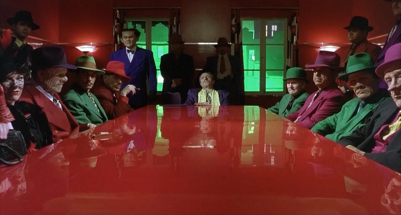
I think it’s not any one person, but when I watch the superhero movies lately, all the Marvel movies…yeah. But one of the last entries in the book is Black Panther, which is a Marvel movie I really like that I think uses color well. Everything really pops. But with the other ones, I think they would be more enjoyable if studios embraced what people loved about comic books which are that they’re colorful. And I think Black Panther sort of goes with [Warren Beatty’s 1990 film] Dick Tracy, which was earlier but is also a literal comic book movie. Everything is cranked up, like all the saturation on the greens and purples and reds—my God, it’s really vivid and beautiful.
Talking about comic book movies makes me think of the most recent Batman movie and how there’s a lot of talk about how dark films look these days and nobody seems to enjoy it. I was wondering, though, is there a more contemporary big-budget film or franchise you think does color well?
I just saw John Wick 4. For as much as I have my issue for that it's so long for like no reason or I could go off on this for like 10 minutes just because there's like franchise bloat, or whatever complaints I have with it, those movies use color in a way that is really poppy and fun and vivid and it moves the action along. The different fight scenes all have like a kind of neon theme the same way, uh, music might have a theme. And so you get pops of red or icy blues and you feel like you're at a rave kind. I find those are fun and they're successful because so many other movies have tried to do that to less effective results


